In November of 2016, Google announced that it was moving toward a “mobile-first” system of indexing, after using what could be called “desktop-first” indexing for its full history.
It’s a huge shift – but it’s one that reflects the way users are searching the web today.
As early as 2015, Google announced that it was getting more searches on mobile devices than on desktop devices. That trend has continued, and while the growth is hardly explosive, the numbers – and your own usage, if you pay attention – don’t lie.
The stats: mobile vs. desktop web searches
According to a Google blog post from May 5, 2015, “more Google searches take place on mobile devices than on computers in 10 countries including the US and Japan.” The company declined to share specific numbers.
It’s important to note that at this point, at least, Google was grouping tablets with desktops – so those mobile searches don’t include the number of searches coming from tablets. It’s unclear whether Google has changed its grouping since then.
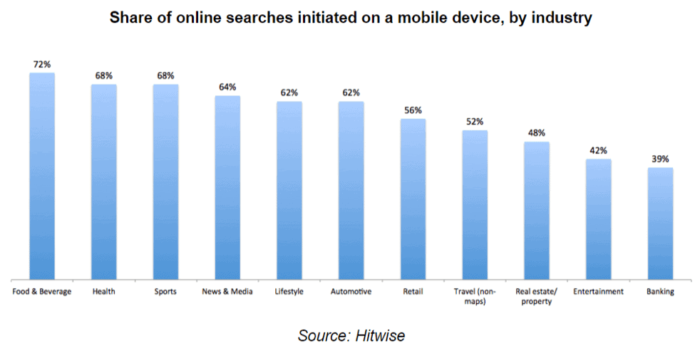
Either way, mobile searches are outnumbering desktop searches across the board – and especially in certain industries. As you can read about in a great article on Search Engine Land, a 2016 report from Hitwise found that about 58% of all searches in the US are on mobile devices, and breaks the searches down by industry in this graph:
Those stats are why Google has decided to experiment with mobile-first indexing. Those stats are also why, if you don’t already have a mobile site, you should probably make creating one a priority.
What is mobile-first indexing?
Indexing is how Google collects information on all of the web’s billions of web pages, which it then “indexes” into a big, huge catalog.
From there, Google’s algorithm decides what search results you see when you search for something.
Until November, Google uses the desktop version of web pages as their primary source – and while they included mobile pages in their index, they were treated as less important. Now, those two are switching places: Google will be using the mobile webpage as the primary, with desktop pages being relegated to second place.
What does this mean for my brand?
It means a few things, depending on what kind of sites you have.
If your site is desktop-only, then Google says you shouldn’t worry about changes in search rankings. They’ll still use your desktop site to rank you.
Where this will hurt you, however, is with the users who are primarily searching using their mobile devices, but that’s a separate issue.
If you have a site that’s about the same across both desktop and mobile, then you really don’t have to do anything. Since they both have the same content, your search rankings won’t really be impacted.
The most significant impact will be on brands that have a mobile site that is different from their desktop site.
If this is you, there are a few things you need to do.
First, evaluate your mobile site. Is it lacking a lot of the content that’s on your desktop site? Is it essentially a stripped-down version of your regular site?
If the answer is yes, this will affect your rankings. Google indexes sites based on their content – not just the keywords, but the amount of content, the quality of content, the rate of updating, and more criteria that no one but Google knows about.
So how do you fix this?
The first step would be to make sure you’re using responsive web design principles in your site building. That simply means that each page responds to the size of the screen on which it’s being viewed, so you can have the same content on mobile that you do on your regular site.
The next step is a big one, and it may need to be done over months: migrate any missing site content from desktop to mobile.
This might necessitate some site building – if you have a blog on your regular site but not on your mobile one, you’ll obviously have to create a tab and a place to house your blog.
There’s no question that this is intensive work, but it’s absolutely worth it – and not just for the Google indexing.
The real payoff is in the user experience, as a good mobile experience is vital to keeping your site visitors happy. It always pays to remember that there are billions of sites out there and your customer could be visiting any one of them.
Don’t give them a reason to leave yours.
How will mobile-first affect my digital marketing strategy?
While the indexing itself shouldn’t really affect your marketing, it’s wise to take this move by Google as a sign of what’s to come.
We’re moving toward a much more mobile-centric world, and you need to ensure that your digital marketing strategy reflects this reality.
The mobile site, of course, is the foundation of any mobile digital marketing strategy, so make sure that’s in place before you move onto anything else.
Once that’s done, you can focus on elements of your strategy like paid social. Make sure that the ads you’re creating for Facebook, Instagram, Pinterest, etc. are mobile-friendly.
You may even want to adopt that “mobile-first” mindset as you’re designing.
After all, we know that more than 50% of all web searches are on mobile devices. So unless your brand simply isn’t suited to mobile devices, and you know that your users primarily access your site through desktops, it’s a good bet that more than 50% of searches for your site are on mobile, too.
If your brand is suited to it, you may also want to consider developing an app. These are especially useful in retail, dining, banking, music, and travel industries, just to name a few.
One important note about mobile marketing, however, is that it’s got to be focused on inbound, rather than outbound.
In other words, mobile screens don’t accommodate the same number of ads as desktops – and the ads that do pop up on mobile tend to frustrate users far more than on desktop screens.
One last thing to consider is that while your own content should be a top consideration, you should consider your curated content, as well. If there are sites that you regularly share links to, make sure that those sites or pages are mobile-friendly.
The wave of mobile-first is picking up speed. Is your brand ready?